|
|
Post by Pug' on May 15, 2007 16:50:07 GMT 1
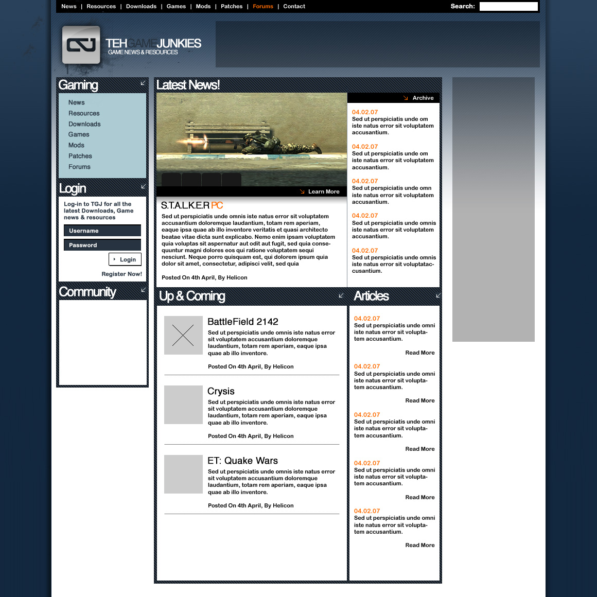
Here's how I myself(not to say all of you will agree) see TGJ in years to come... This is just one example. I thought that I would show you all this little design  Keep in mind that i'm simply showing it to help create interest. Helicon has seen it. I'm in no way trying to cause problems as I love TGJ how it is, and I can imagine is staying as is for a long long while.   |
|
|
|
Post by 0 on May 15, 2007 16:53:07 GMT 1
It looks nice. I especially like the top left banner and text. looks cool  So I know Spanish in years to come do I? lol |
|
|
|
Post by Pug' on May 15, 2007 16:59:32 GMT 1
Haha! It's used for all designs It's a known form of lettering that does not distract the clients "Eye For Design". If it was English they would read the text and not look at the design and layout. Its called Lipsum. you can find the history about it here www.lipsum.com |
|
|
|
Post by 0 on May 15, 2007 17:01:32 GMT 1
Hmm I never looked at it that way.. Learn something new everyday.
|
|
SIZZLE
 The Nadester :D
Posts: 139
|
Post by SIZZLE on May 15, 2007 17:44:00 GMT 1
that looks awesome man
|
|
|
|
Post by M.J. on May 15, 2007 18:11:45 GMT 1
yup looks great and the best thing is that i will be a part of this when it happens.
|
|
|
|
Post by Pug' on May 15, 2007 18:44:12 GMT 1
I'm hoping everyone here at TGJ will get a bite of the cake when it arrives! Thanks for the comments guys.  |
|
|
|
Post by 2cool.be on May 18, 2007 9:32:09 GMT 1
Must say I'm impressed m8 , that looks sweet
|
|
|
|
Post by ReNJi' on May 18, 2007 14:05:41 GMT 1
Yeah Looks sweet m8, seems to be hard !
|
|